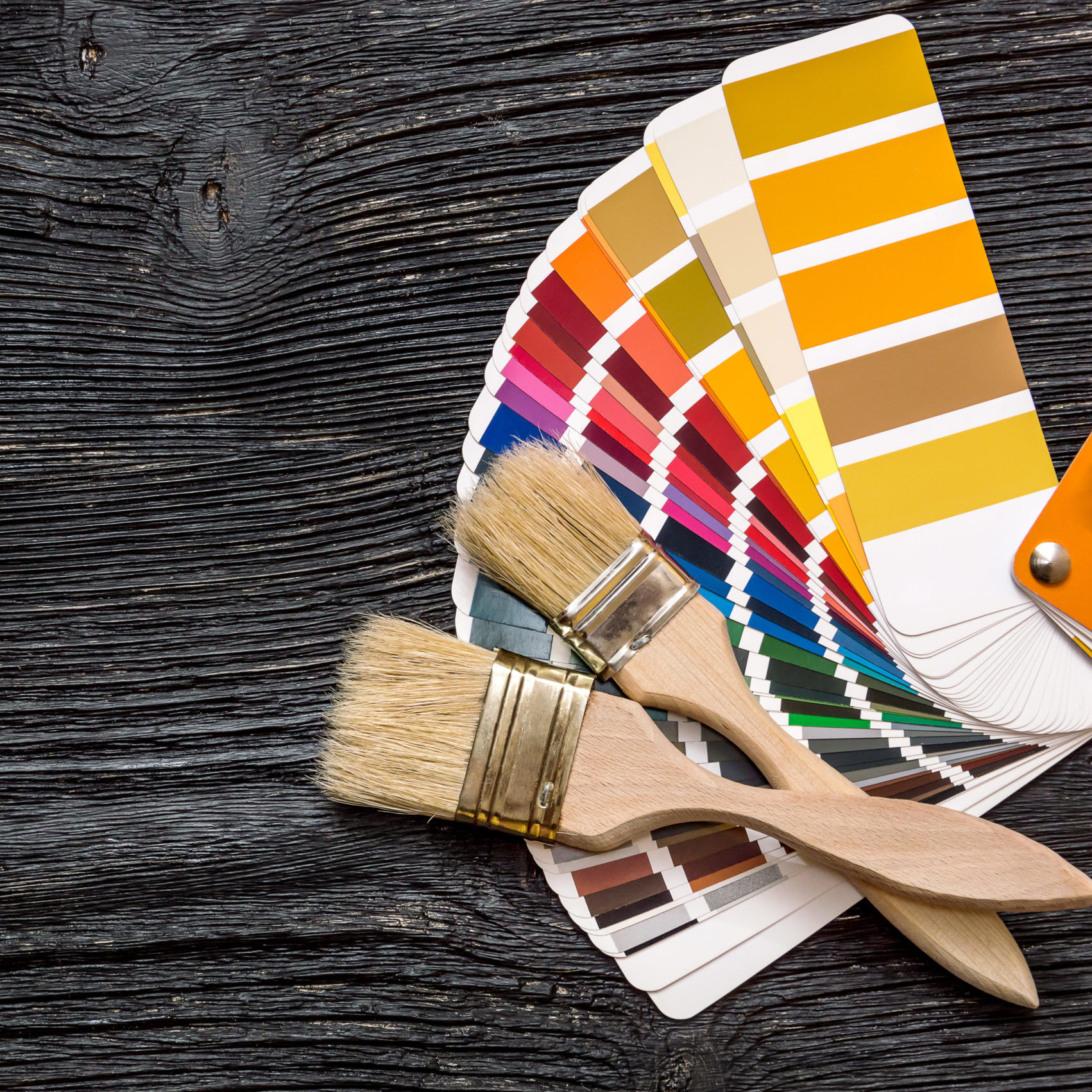
Young children are innately curious, and they have an intuitive connection to colour that most of us lose in adult life. Children choose colours that make them happy in a very instinctive way. When designing a playroom, the choice of colours is so important for children because of this heightened response to colour.
A playroom ideally should have different spaces for different activities – a space for high energy active play and a quieter space for reading or relaxing. Here are my tips for colours that work well in these different spaces.

Colours that promote activity and physical play:
Orange – the colour of fun and playfulness and will support fun play and social interaction.
Yellow – a sunny uplifting colour that will promote happiness
Red – used in moderation this colour will promote physical play but don’t use too much of it as it could lead to more aggressive behaviour.

Colours that support quiet play and creativity:
Dark blue – promotes focus and concentration.
Light blue – light blue – think of “blue sky thinking’ – this colour promotes creativity and daydreaming.
Soft greens – promotes reassurance and calm.

Using combinations of these colours will provide emotional support to children and drive how they feel and behave in these spaces.
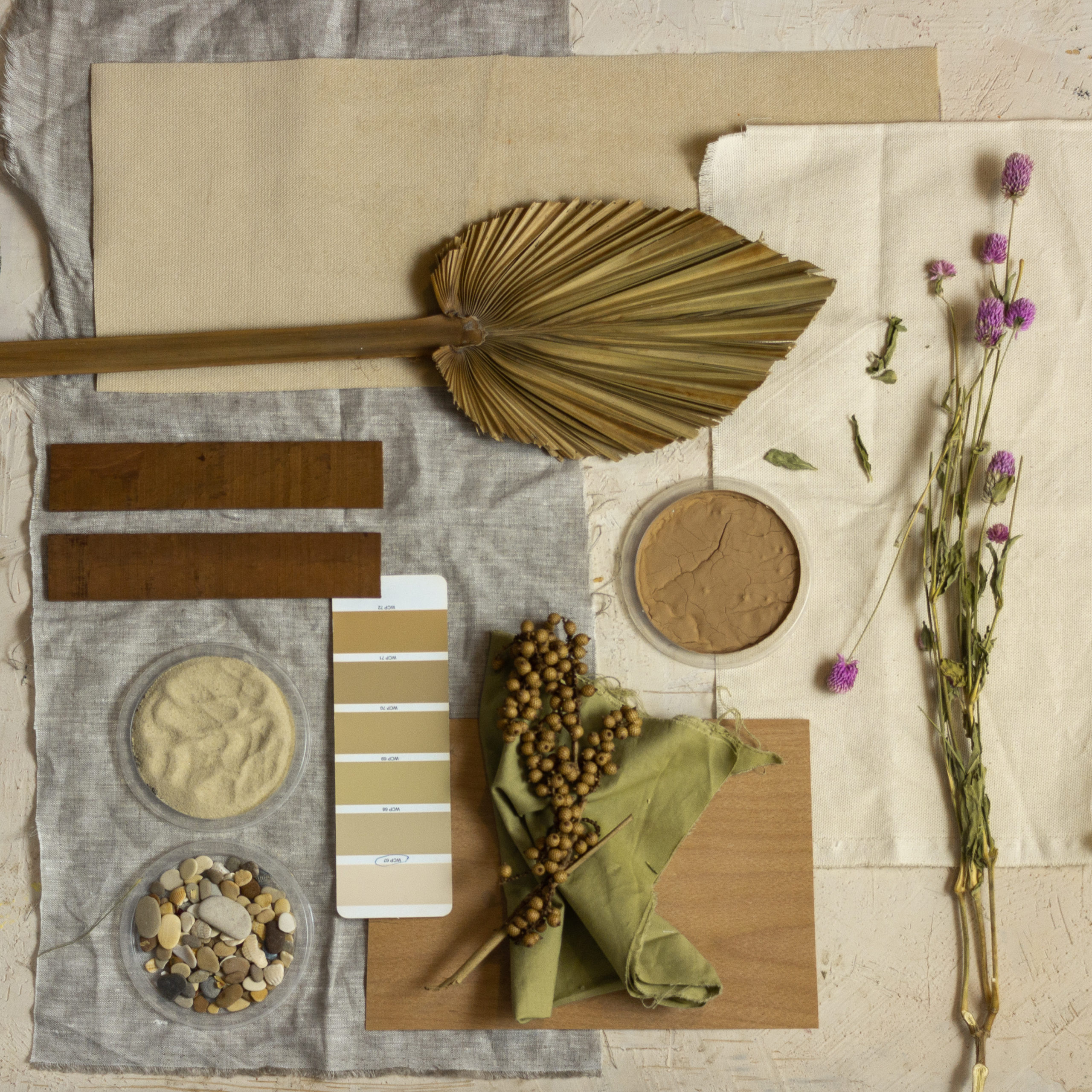
Adding colour to a playroom is not just about painting the walls. Colour can be added through the furniture, toys and accessories such as a colourful rug or lampshade. If you don’t have space to create different zones in your playroom, you can always carve out a corner of their bedroom or another space in the house to create a quiet soothing nook for those more relaxed moments.
Want to find out more about the power of colour and creating amazing spaces that work for your whole family? We offer colour consultations to help create wonderful colour schemes. We go beyond the colour chart harnessing colour’s superpowers and using our in-depth knowledge of colour psychology to find your perfect colours. Drop us a note today and we will be in touch. studio@grovedesign.london
More Blogs

The Incredible Impact of Natural Light on Colour
The Art of Making Neutrals Schemes Fantastic